iVogel is a Munich-based company that develops utility and entertainment apps for iOS environment. The company approached me with a request to redesign an existing app. The goal was to move from skeuomorphic to more flat look and provide better hierarchy, more user-friendly experience. The design process also included steps such as redefining key functionality and structure of application.
Compass54 is available for download on iTunes.
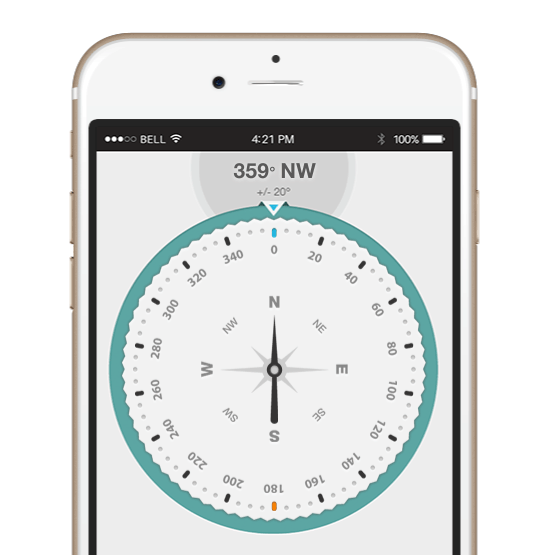
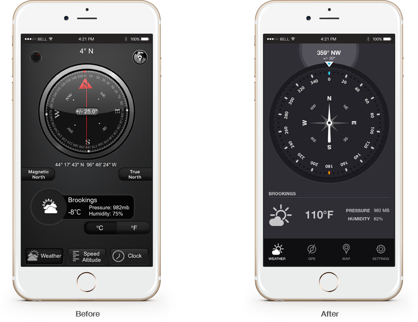
In the before/after screenshots below you can see the difference in organization of elements, use of negative space, and clarity of displayed information and transformation from skeuomorphic to flat look.
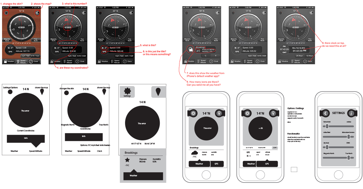
First, I ran a quick heuristic evaluation and analized the current app with the client. This is quite a simple app and I found that providing a clear grid and information organization will solve many of the current problems.
In addition to designing this application the client had an idea for a mark that I helped to develop into the company logo. The initial sketch was provided which guided the process of creating the mark.